Every now and again, the tech industry brings out innovative devices that unfold new capabilities and make our pursuits ever so easy. Unfortunately, the same is not true for our website designers! With varying screen sizes, features, input mechanisms and individual limitations of every device, learning new tools and techniques is a staple role of being a designer.
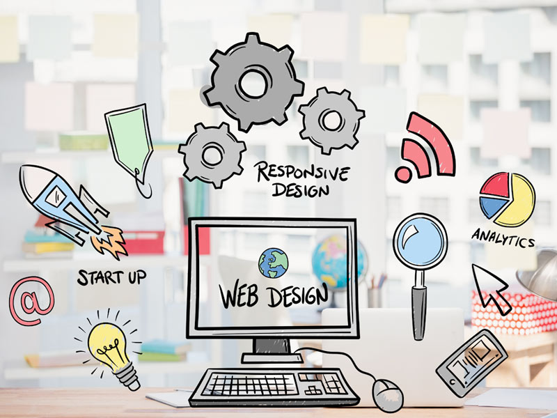
Website designs that offer a harmonious mix of great user experience and multi-device functionality are one of the hottest trends today! Simply put, a website with a responsive design will be able to adjust automatically across various displays to facilitate optimal readability and seamless navigation.
To counter the challenges associated with designing responsive websites and to help designers maintain a competitive position in the market, many commendable designing tools have been introduced in the market to make your job simple and easy!
Here are the best design tools that can help you become the master of your profession!
Gridset
By using Gridset as your designing tool, you can design, prototype and build responsive custom layouts based on grids. This allows you to curate any type of grid you want in your project, even those regular columnar grids found in many CSS frameworks.
Gridset can be integrated with diverse content management systems such as Joomla, WordPress and Drupal, as well as with popularly-used graphics applications including Photoshop and Fireworks.
Wirefy
Wirefy is lauded for its ability to give out responsive websites. It only requires a fundamental knowledge of CSS and HTML to start generating unique wireframes.
The fact of the matter is that Wirefy consists of responsive HTML snippets and templates. They mechanically adjust as the browser is resized while functioning across different devices. If you are working for a client who values website content over everything else, Wirefy may afford you the liberty to create responsive designs.
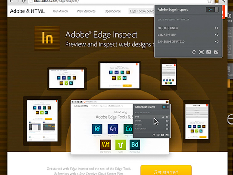
Adobe Edge Inspect
Wondering how a web page will appear across different devices and varied screen sizes? Adobe Edge Inspect is the designing tool that can help you find this out!
Adobe Edge Inspect gives you the opportunity to preview the performance of your website. This mobile device allows you to inspect the website’s adaptability across devices like the iPad, iPhone, Galaxy Nexus, and more. This saves you from the stress of dealing with different devices to inspect the various aspects of the site.
Gumby2
Easily downloaded and customisable, Gumby2 has been developed with efficient CSS pre-processor SASS and offers a smart framework for responsive web designs.
From quickly-loading images to strongly embedded videos of difficult ratios, Gumby2 offers wide features. These include grids, buttons, toggles and switches, forms, tabs, dropdowns, drawers, as well as templates.
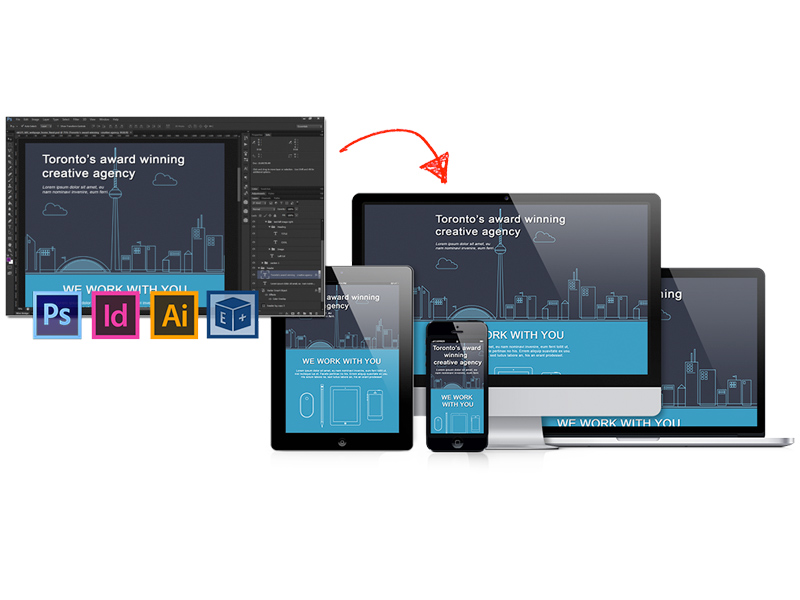
Adobe Edge Reflow
Edge Reflow is another smart creation of Adobe that allows for visually designing of responsive websites. Adobe Edge Reflow can easily convert the content in Photoshop documents (PSD) into HTML and CSS. It then visually adjusts the structure through breakpoints.
As a powerful visual design tool, it can also accommodate drag-and-drop content files and allows to make formatting edits through panels. However, it is important to have basic knowledge of HTML and CSS to work with Adobe Edge Reflow efficiently.
Invision
Invision is a strong platform where team members can share the design transitions of a website across various screens among themselves. This designing tool facilitates uploading functional designs and creating communication between the other team members.
One amazing feature of Invision is that you can share clickable designs through SMS. In this way, a designer can test the design easily and quickly. Of late, the company has also introduced its adaptability for Android phones.
Export Kit
Export Kit has surfaced in the market as a useful designing tool. It allows you to convert a Photoshop document (PSD) into HTML5 in just a matter of few clicks and provides advanced HTML and CSS features. Having a clean and valid PDD to HTML5 transformation is now possible in just a few minutes with Export Kit!
This smart tool can simplify your coding by quickly and easily converting your PSD into HTML, CSS, WordPress, JS, Android, and more! Designers can impress their clients by efficiently creating all the assets they will need with Export Kit. These assets will empower your clients to use or modify your output files promptly.
UxPin
A collaborative design tool accessible online, UxPin allows designers to generate interactive wireframes and prototypes. This immensely powerful designing tool gives out highly polished wireframes. This gives the users a comprehensive tool kit consisting of essential design elements. It also provides an extensive collection of custom UI elements.
UxPin is particularly useful for advanced designers whose creative instincts rejoice in producing aesthetic, colourful wireframes.

Conclusion
Responsive websites appeal to both the human brains and the search engines as they deliver a consistent and seamless experience to the users across different devices. In our mobile life, we constantly switch between devices to get things done. Accordingly, we expect our applications to be flexible and adaptive in all environments. Surely having functional and usable websites that are independent of screen widths is crucial for the growth of every business. Nothing but the best web page design tools are the need of today’s designers!